Visconti told to the lovers of letters

You may have heard of the Book of Hours of the Duke of Visconti, a beautiful Italian manuscript from the late 14th century.

You may even have studied fragments of it, whether it be the magnificent rotunda gothic of the text or the countless elements of decoration and illumination.

But do you really know it?

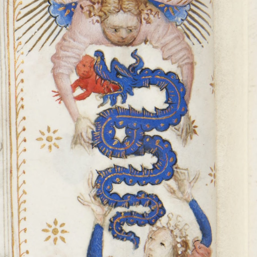
What is this snake that seems to be holding a child in its mouth?

What does the word dompne mean in the last line? And does a scribe make a lot of mistakes in copying?

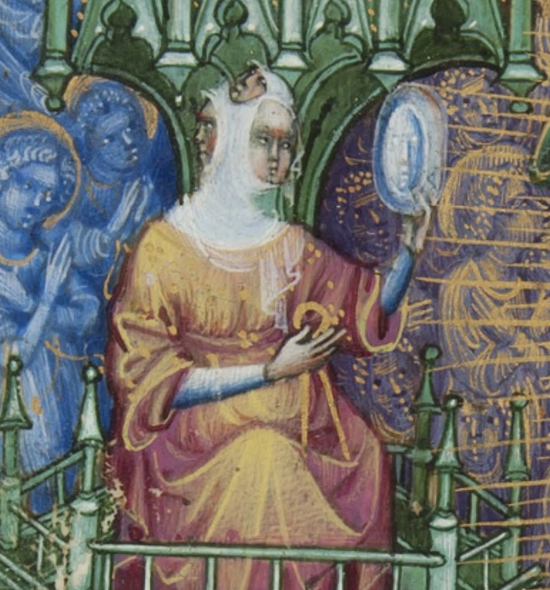
Who is this “woman” with three faces?

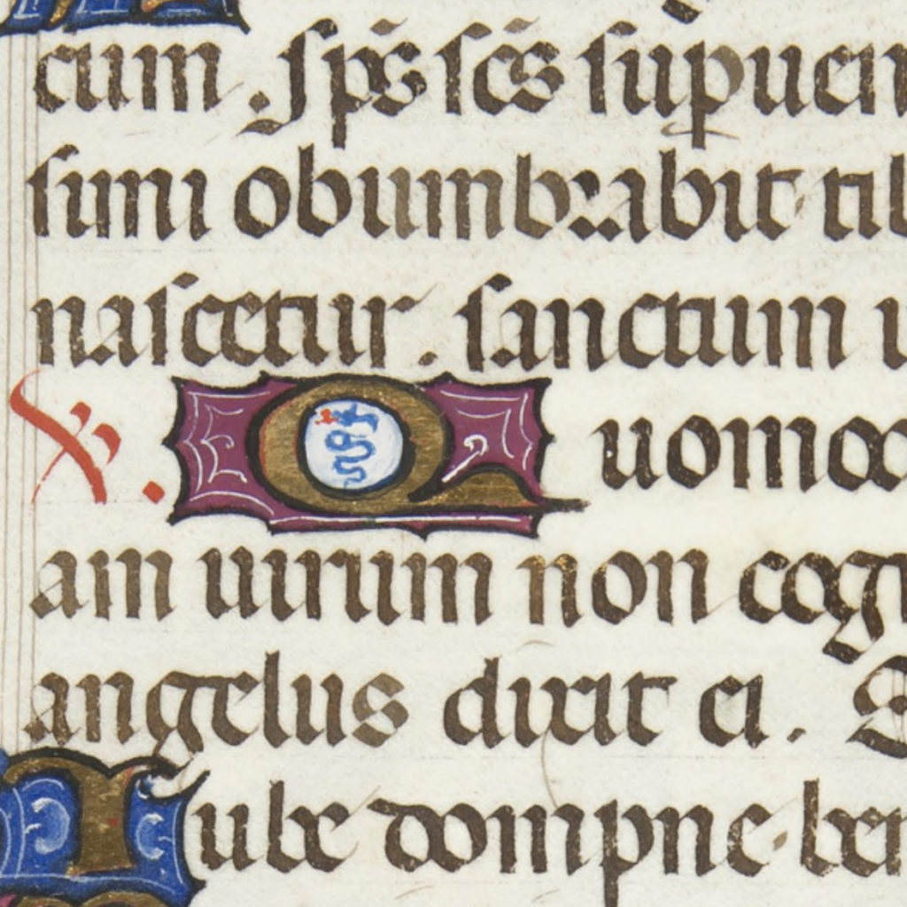
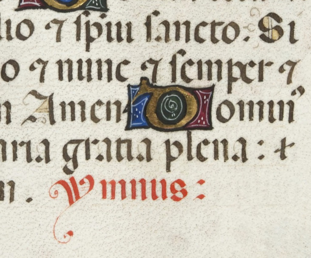
Where are the beautiful capital letters (including the Y) in this manuscript?

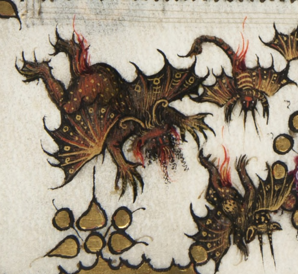
Who are these fiery characters?

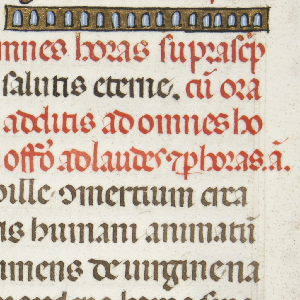
What do all these abbreviations mean?

to answer all these questions and many more, you can register for my zoom conference on February 13 at 6pm (replay available for a week) by clicking here

B as in Bird

This is probably a little letter from the book of Kells (I think), made more than 15 years ago (that’s why the source is not very trustworthy), and it has been forgotten in a drawing board for more than ten years.
I didn’t add the colors (in case you haven’t noticed, color is not my thing) but it’s probably pretty much in line with the original from a design point of view (& not color)).

Last commission before Xmas

If you want me to draw an initial or to write a text for this Xmas, it’s too late. I just finished the last commission & will not be able to do anything else before Xmas (you can still buy some of my older works 😉 ).

Here are some pics of the different steps of the work.
The instructions were a blue R and something about the sea. I looked at some old medieval maps and let my nib ramble on the paper.

gilding & painting of the letter.

Drawing of the structure of the filigrees and first pattern
End of the cobalt blue filigree
End of the end of the final thing
I used prussian blue & colbalt blue (watercolor), gilding is done with gold leaf over acrylic gesso as usual, the whole thing has been made on Arches watercolor paper.

Corpses of cities

At last, I’m done with the calligraphy of Giovanni Papini‘s short story, Corpses of cities.
I used most of my favourites techniques to do this job and I must say that I’m quite happy with the result.

Embossing on carbon paper


Zinc engraving and filigrees


To have a look to the whole work, click here.
Other close ups are available here and there.