Me fecit

Because I don’t thank her enough for the excellent work she does to highlight my compositions with her frames, because she deserves to be fully associated with my work, I made this little stamp for my wife.

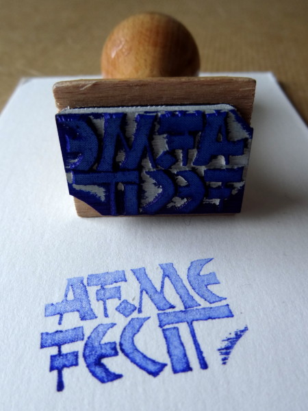
This is of course not enough to account for all the help she gives me (you can imagine that she is not only framing my works) but she will now at least be able to put her signature on the back of the frames.

Write !

A beautiful text by Colette on the act of writing from La Vagabonde.
It’s only a fragment, she talks about it in different ways, but it’s the one that caught my attention the most.
Who knows, maybe I’ll calligraphy the rest another day?

I was very influenced by Rudolf Koch in this composition, first with the title in NEULAND, then with the gothic script, inspired by the one found in his book of signs.

And, to contrast, I have chosen a less “violent” humanistic script for the second part of the text.

The bright day is done…

…and we are for the dark.

I don’t know if it’s the end of summer approaching, the various events that are not very good in my life and more generally in the world, but this quote has been imposed on me recently.

It is based on Shakespeare’s play Antony & Cleopatra.

I covered a white watercolour paper with iron gall ink, which I then embossed. And part of the text has been engraved on zinc to have both brilliance and darkness.

The script used is an approximative copy of a gothic script by Rudolf Koch that I have to keep working on to really make it my own.

Magic Mirror on the wall, who is the fairest one of all?

Tell me I’m the one, otherwise I’ll break you once more in tiny bits.

Inspired by kintsukuroi but not having the necessary amount of gold on hand, my wife repaired an old broken mirror with kraft that I then decorated with this little warning: -D

The flies

A draft, made a long time ago.
These are selected bits from the play Les Mouches by Sartre. I used different gothic scripts for the different characters.
The obvious things to do for the final version are :

  • use a paper a little better than this one
  • remove the red versals, stay in monochrome + gold, maybe insert some cadels instead
  • revise the script used for Orestes and Electra
  • add a few more lines
  • and do it all on a paper big enough to have only one column!

If all goes well, the final version will be released this summer.

XIIth century initials as XXIst works

Quite happy with the result produced by the combination of embossing and ink experimented on Julien Gracq’s text, I decided to reedit the experience with initials copied from XIIth century French manuscripts.
This time I used walnut stain instead of India ink and I find the result just as interesting, judge for yourself.

Know Thyself

… and thou shalt know the universe and God.

This phrase has been on my list of things to calligraph for several years. After several attempts at very different compositions, I think I have found what suits this phrase affixed to the pediment of the temple of the oracle at Delphi.

Of course, it’s the French version here 🙂

Seneca Draft

For several months, I had this paper from Kéréon mill that I didn’t know what to do with. Very nice paper but quite difficult to use because of its composition (linen + peat) which gives it a very rough surface, even uneven.
And last night, the illumination: the crate wood!
I only recently started using this “tool” for calligraphy because it’s not really made for small writing modules and I have a hard time working in large format, not that it’s difficult but I don’t find it very beautiful in general.
Anyway, here is a first draft made with Indian ink and crate wood on this exceptional paper.

I think I will continue in this way, with a slightly smaller module (here the letters are 6 cm high) and I hope to have a composition soon with this fragment of a text of Seneca.