The flesh is sad…

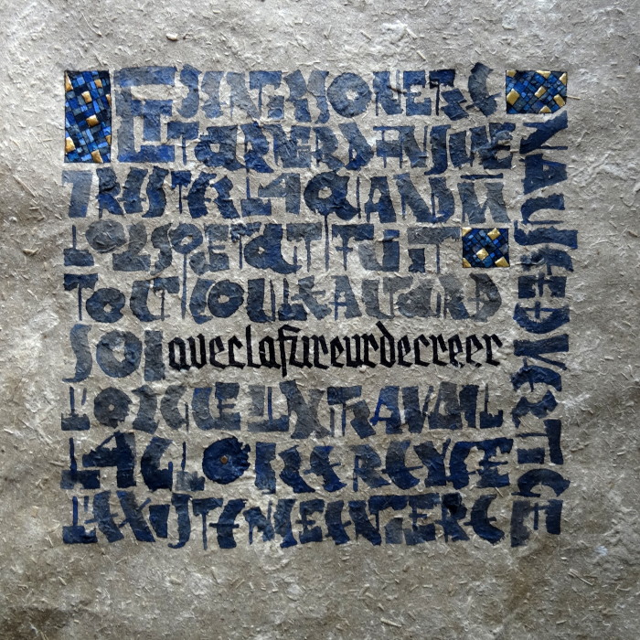
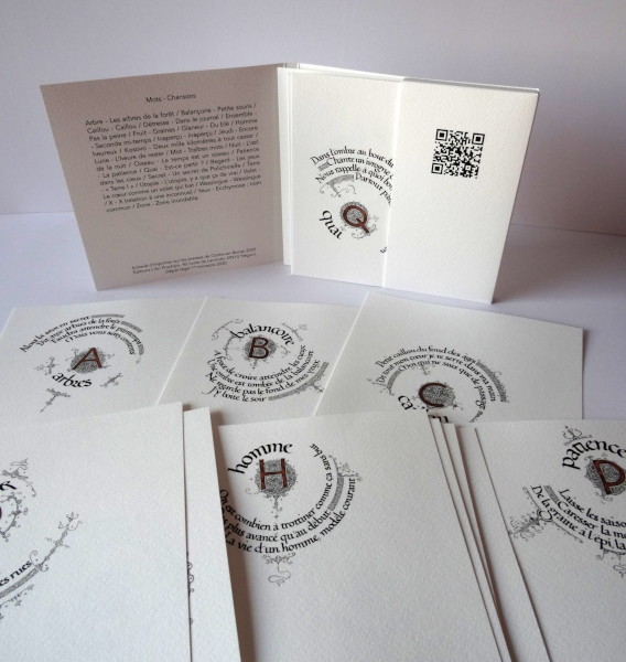
  …alas, and I read all the books

Fragment of a poem by Mallarmé realized on a page of a dictionary (the book par excellence).

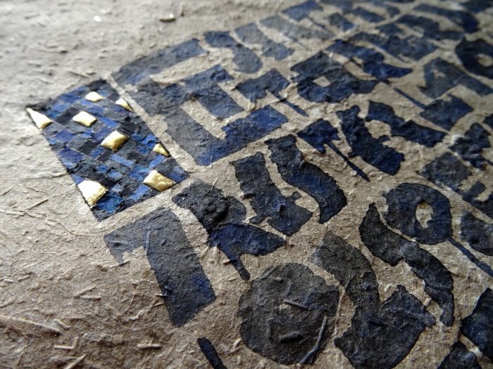
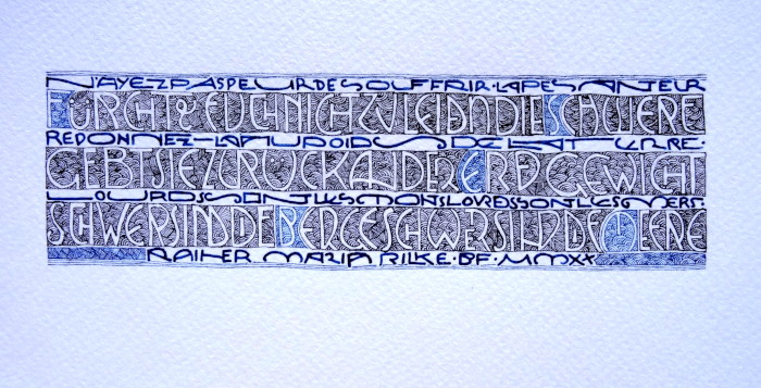
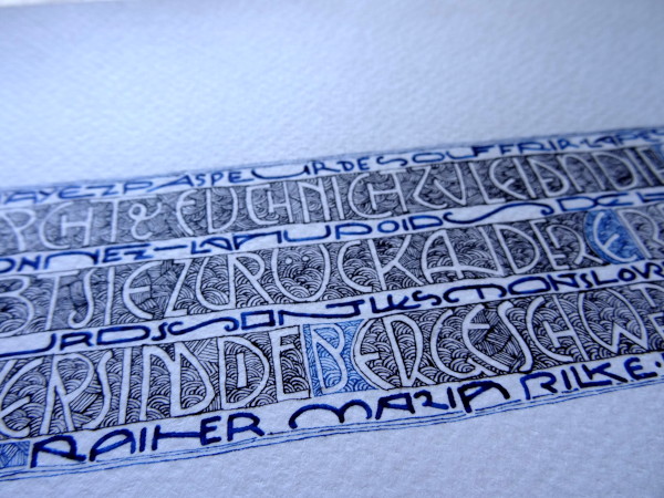
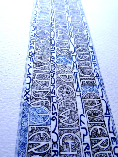
And, to be a little in my era, I calligraphed these verses with a palette pen by reinterpreting a typeface, the COURIER NEW whose spaces are somettimes  bad and which still are in my interpretation.

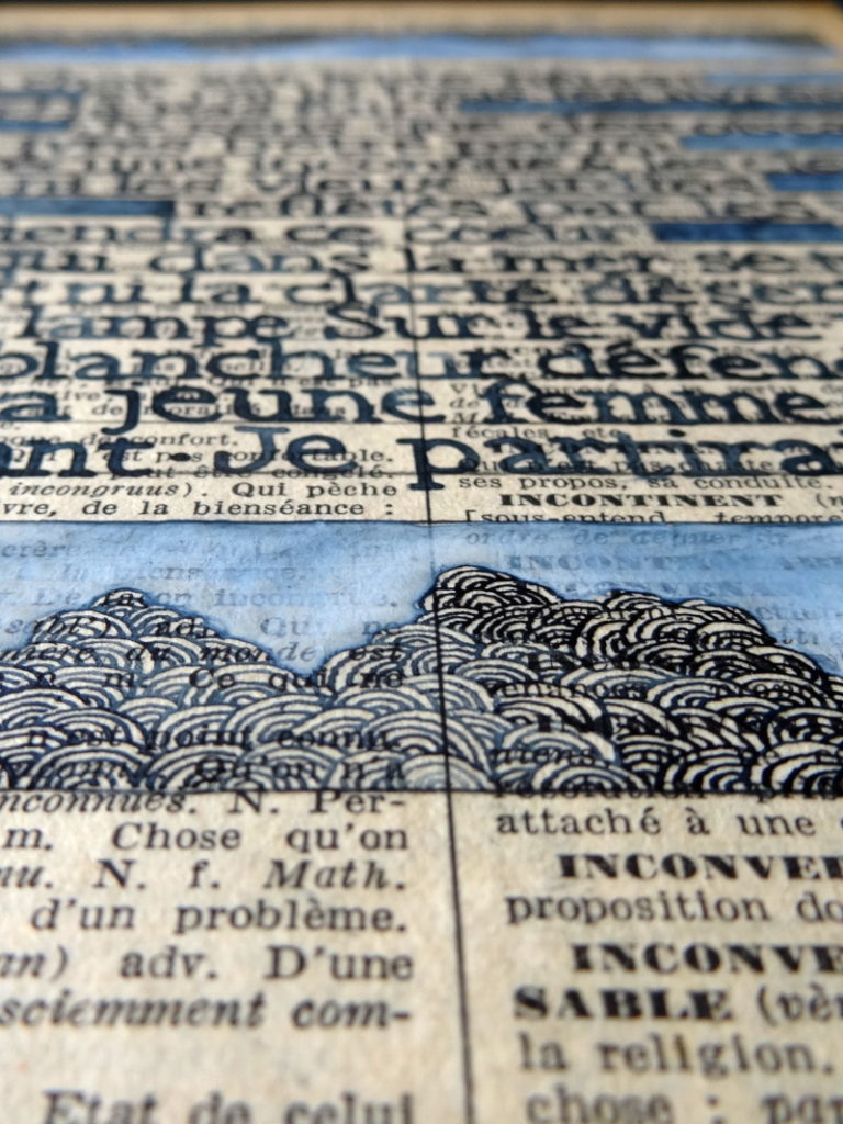
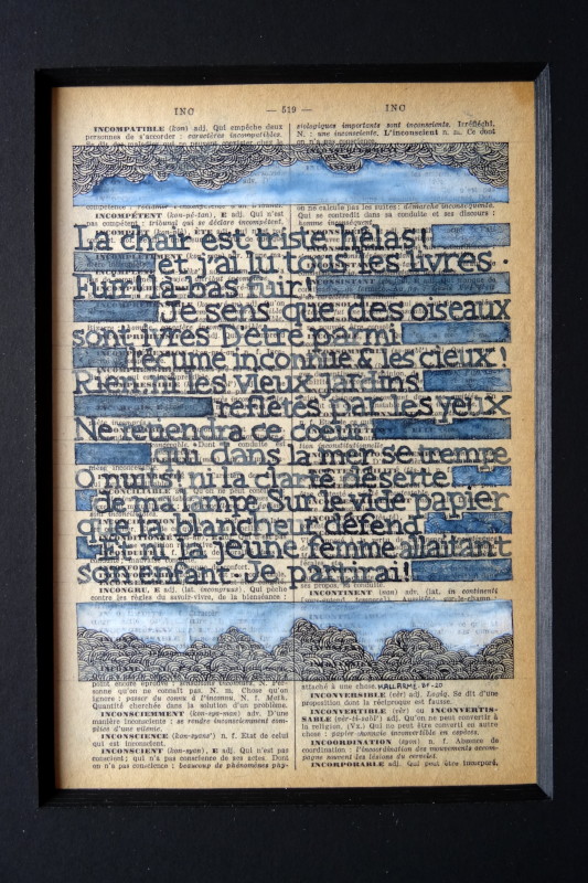
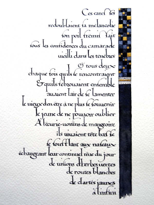
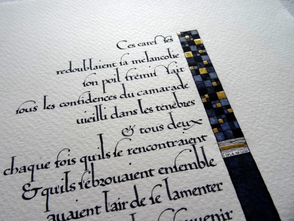
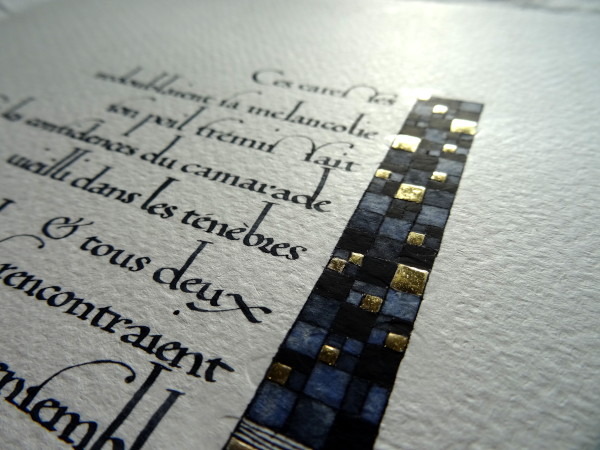
The whole was calligraphied in Payne’s grey and, for decoration, a little bit of watercolor with some white and ultramarine blue.

The fury of creating

 A new composition with a NEULAND reworked on a text by Emile Zola proposed by my wife.

The writing was done with a piece of wood and watercolor (Payne gray), the decoration is inspired by the tiled backgrounds of the Gothic period with a line whose center is the O of glory at the penultimate line.

I used several blues and greys as well as gold leaf for the small decorative elements.

The paper is a mixture of hemp and linen with straw inclusions.

I would like to take this opportunity to remind you that I will be conducting an online course (in French) on NEULAND on December 12 & 13.

Apocalypse

 It’s a bit trendy, isn’t it?

In any case, while I was emptying my boxes, I found a version of chapter 12 of the Apocalypse made a few years ago.

There is rustica and uncial for the Latin version, the French version is in carolingian.

And there is colour, too much for my taste, which is why this work sleeps in a drawer.

Hello !!

 It’s been far too long since I’ve posted anything. Various contingencies have kept me away from my computer.

For my return, I am sharing a monogram that I made a few weeks ago but that I didn’t want to show until it had arrived in Australia, at its addressee’s home. It’s done and so here is Linda’s monogram, LCK, hand-made linen paper, gold leaf and, as far as colours are concerned, a mixture of Payne grey, Prussian blue and cobalt blue.

The circle of filigrees is about 8 centimetres in diameter.

The course not to be missed !

On the 17th and 18th of October, I’ll teach a course on the second bible of Charles the Bald (writing and decoration) at the cultural centre of Welkenraed.

Originally planned for April of this year, it could not take place because of the pandemic.

There are still places available (with masks and distances) for fans.

So if you don’t want to be the one who doesn’t get the fries in the same package, contact the cultural centre quickly to register!

I can’t wait to go back to Belgium and eat those crispy fries, whatever the package 😉

Day’s dream

 A work for four hands and above all for two brains. My wife offered me this fragment of Zola’s Germinal. And we both worked on the composition, the writing, the colours.

Then, of course, once I had finished scribbling on the paper, she did the framing.

I am very happy with the result.

The writing is a 16th century humanistic, and I am happy to have gone back to an older type of decoration, the tiled background for the strip on the side.

Different dilutions of Payne’s grey and leaf gilding to bring the light.

Gravity, give it back to the weight of the earth…

Fourth and last version of my fragment of Rainer Maria Rilke’s Sonnets to Orpheus that I was telling you about here.
The first inked version does not satisfy me so I changed for an intaglio lettering for the original version and a very small and elongated version for the French translation.

All this is done on watercolor paper, iron gall ink and Prussian blue.