Monogram

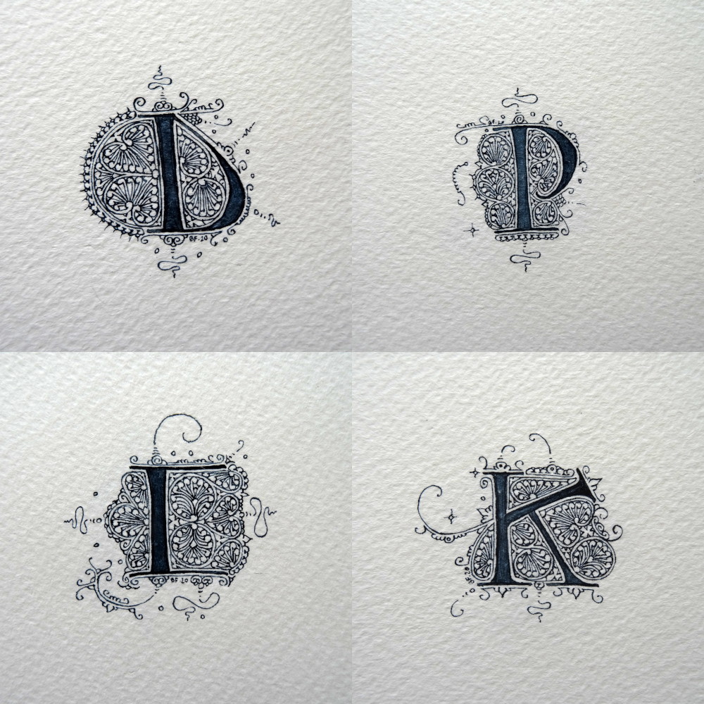
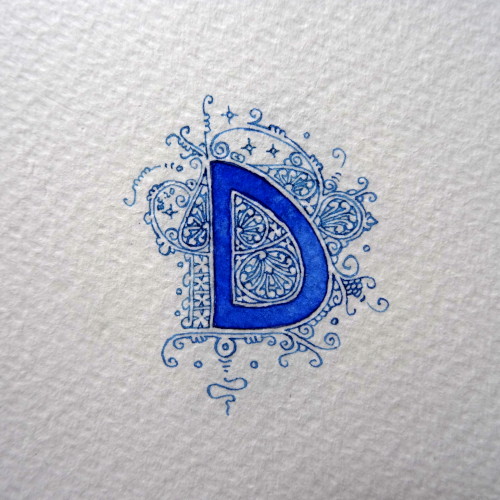
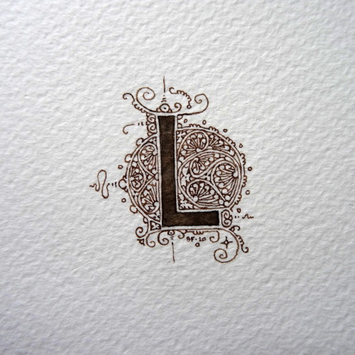
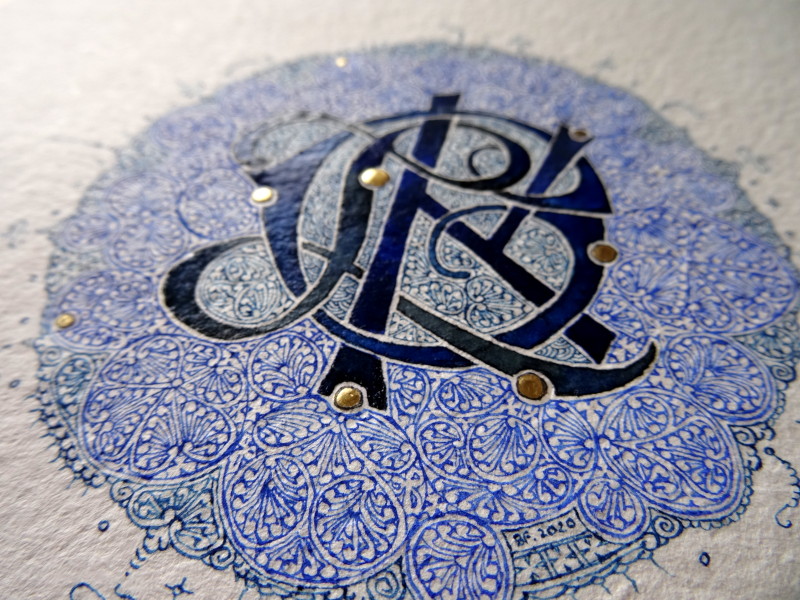
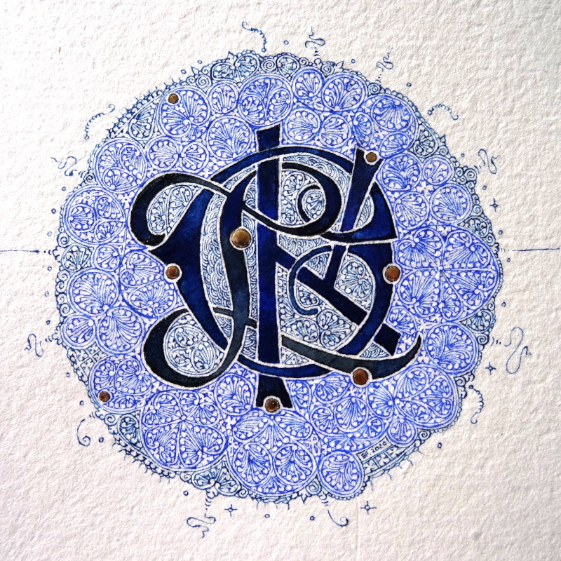
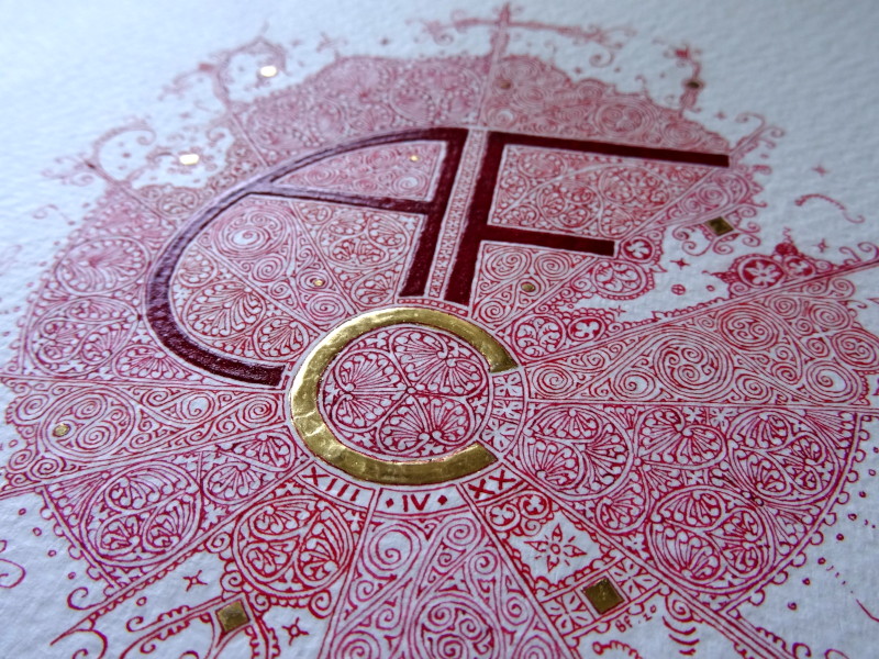
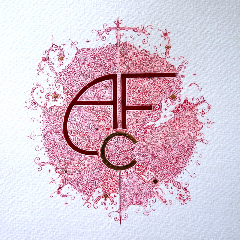
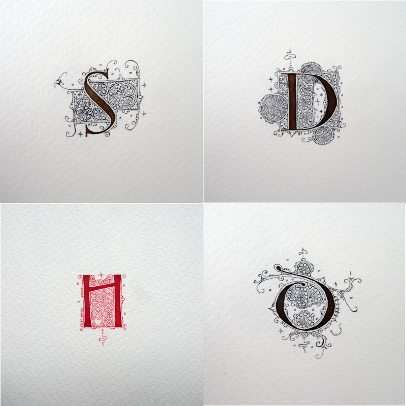
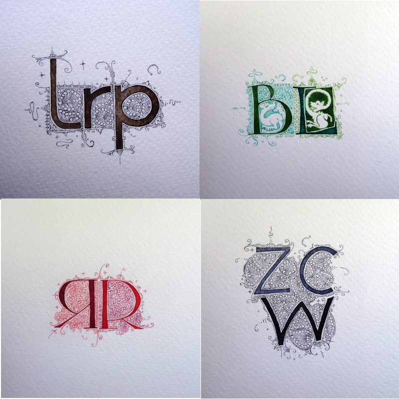
It’s been a long time since I posted filigrees…

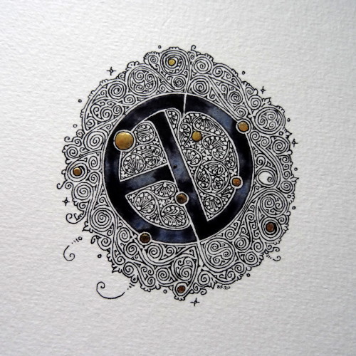
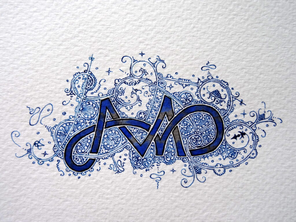
Here is a monogram made for a commission to make a tattoo (I think it’s going to be painful).

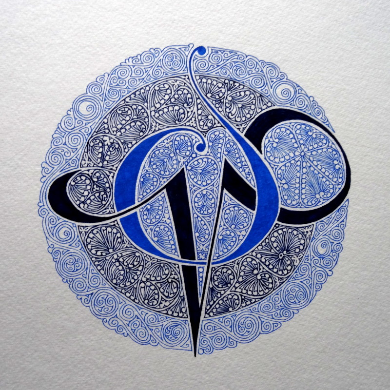
The overall design is 15cm in diameter, acrylic paint on paper.

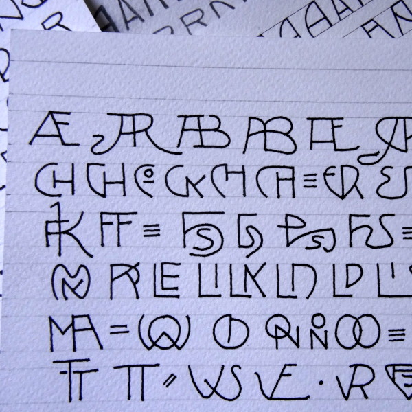
And, if you wonder how to make things like that, there are 2 new online courses scheduled. Check this page to get more information & register.

December 25

 The Christmas holidays are approaching and you may not know what to offer your loved ones in these troubled times.

I propose you filigreed letters and monograms.

The materials (inks, paints, gilding, papers) are used according to your requests.

Prices range from 20 to 200€ (excluding shipping costs) depending on the size and complexity requested.

For any order, you can contact me by mail or by phone from the contact information displayed on this page.

some recent examples with a quartet of Payne grey lettering 2 cm high

and then a lighter blue for a D of the same size

walnut ink, always at 2 cm

And a large monogram (letters of 4cm and filigree of 10) with gilding. 

Hello !!

 It’s been far too long since I’ve posted anything. Various contingencies have kept me away from my computer.

For my return, I am sharing a monogram that I made a few weeks ago but that I didn’t want to show until it had arrived in Australia, at its addressee’s home. It’s done and so here is Linda’s monogram, LCK, hand-made linen paper, gold leaf and, as far as colours are concerned, a mixture of Payne grey, Prussian blue and cobalt blue.

The circle of filigrees is about 8 centimetres in diameter.

Art Nouveau

I am currently working on a new template for an Art Nouveau alphabet from the magazine Ver Sacrum, published between 1898 and 1903. It is an extraordinary publication, both in terms of lettering, illustrations and texts. The Heidelberg Library offers a complete digital version of all the magazine’s occurrences. I’m enjoying it!
As an example, here are a few monograms and ligatures picked out here and there.

Monogram

For a commission, I made this monogram with the initials of both parents and those of their children.
I was only allowed to use black, so I used 3, a black from Mars, a ferro-gallic ink & an ivory black. The difference is subtle and does not really appear in the photos. The main thing is that the patrons are happy, right?