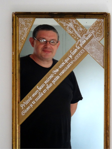
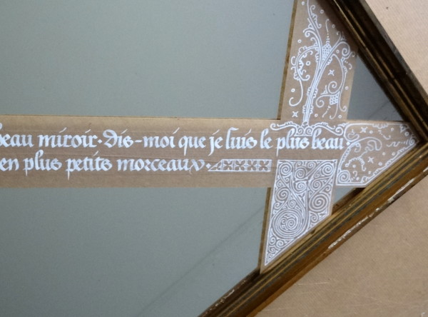
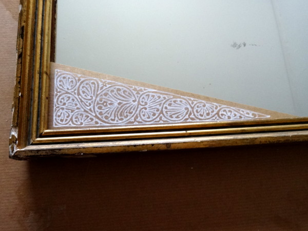
So here are a few little filigrees 🙂
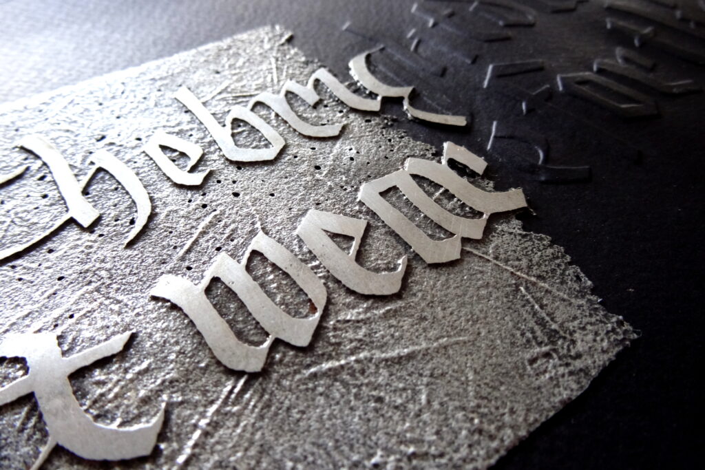
…and we are for the dark.
I don’t know if it’s the end of summer approaching, the various events that are not very good in my life and more generally in the world, but this quote has been imposed on me recently.
It is based on Shakespeare’s play Antony & Cleopatra.
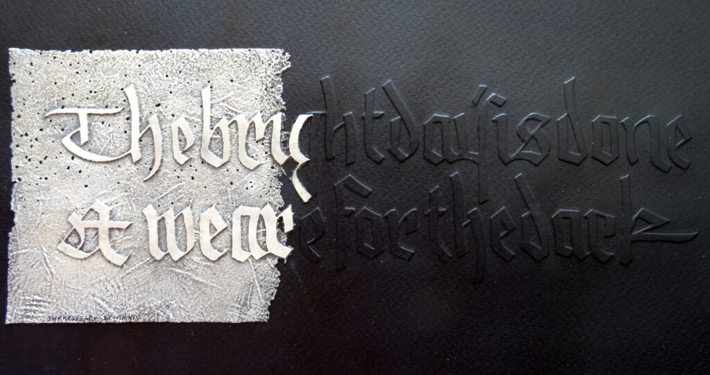
I covered a white watercolour paper with iron gall ink, which I then embossed. And part of the text has been engraved on zinc to have both brilliance and darkness.
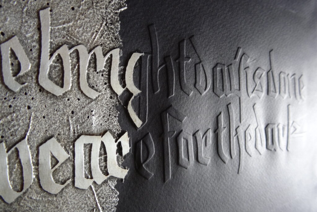
The script used is an approximative copy of a gothic script by Rudolf Koch that I have to keep working on to really make it my own.
Today is a great day, it is the day when I will set up my exhibition at the Aventurine Gallery in Le Conquet.
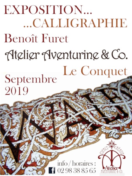
It will remain in place until October 1st but that is not a reason to wait until the last minute 😉
The gallery is open every day (except Monday), I will be present in the afternoons during the weekends.
My wife, who is (among other talents) an excellent framer, offered me a small round frame in mahogany tones and told me to find something to put in it.
Challenge taken up (after several failures). And I chose, you’ll never guess,… filigrees!

I used two very different dilutions of the walnut stain to get a little more variety. And, if you ask yourself the question, the circle is 7.5cm in diameter.

Among the authors I like, there is Eric Vuillard. And among the books he wrote, I particularly appreciated La tristesse de la terre (The Sadness of the Earth). Here is a fragment of it.

I first wrote the text on standard paper before transferring with white carbon paper on a black background, then I touched up the outline of the letters and added the decoration with watercolour.

I wanted to keep the idea of the snowflake, so the text is not very readable, I give it back to you in an approximative translation: “How delicate a snowflake is! It seems like a tired little secret, a lost, inconsolable sweetness.”
If that’s not pure poetry, I’ll eat my hat.
Some have pointed out to me (rightly) that I calligraphy almost exclusively male authors. For a change, here is a fragment from the novel Les Personnages by Sylvie Germain.

I made the three O’s with a bit of a crate immersed in very thick walnut stain, the rest of the writing is a small humanistic made with more diluted stain.

For a long time I wanted to calligraphy this fable in its Latin version because no, it was not Mr. de La Fontaine who invented The Raven & the Fox.
It’s not Phaedrus either, but it’s the version I chose.

And as I can’t draw, I could only show in the border the fall of the cheese and not the protagonists 😉

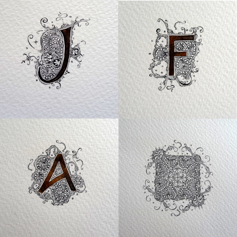
For a commission, I made this monogram with the initials of both parents and those of their children.
I was only allowed to use black, so I used 3, a black from Mars, a ferro-gallic ink & an ivory black. The difference is subtle and does not really appear in the photos. The main thing is that the patrons are happy, right?