Today, it’s chemistry !

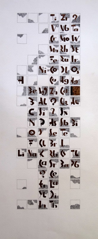
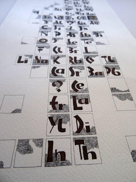
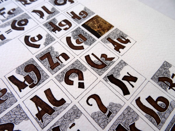
And it is a reinterpretation of Mendeleev’s table as he presented it in 1870.
Of course, some elements are missing compared to what we know today and the usual representation reverses the lines and columns compared to this one but it is always good (or almost), to return from time to time to the fundamentals 🙂

I calligraphed the symbols of the elements with walnut stain and I decorated the table with iron gall ink, decorating the different cells with small clouds of electrons.

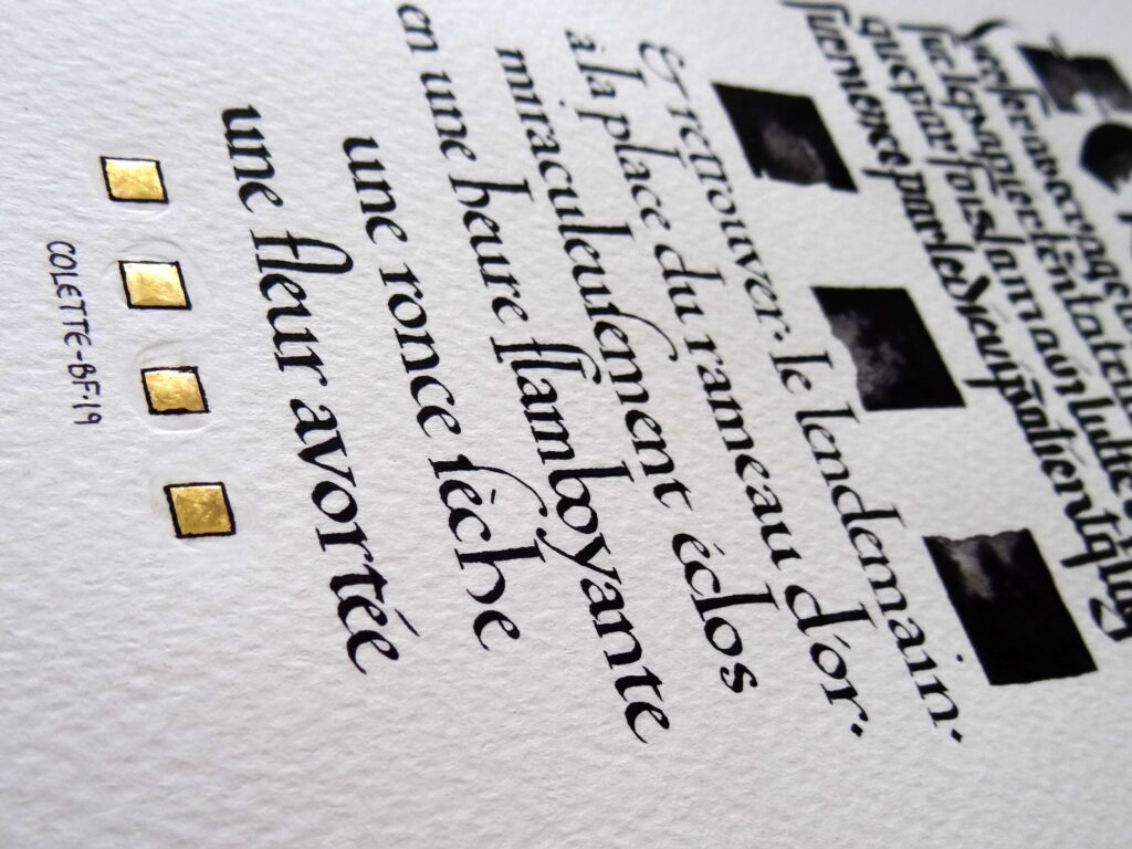
And (I shouldn’t say this but you don’t get to do it again), I had made a mistake in the position of the gold (Au), I cut out the incriminated square and replaced it with an embossing of a golden patina that my wife had made on kraft paper. I think it’s very beautiful, it’s normal, it’s my wife who made it 🙂

E ?

Little exercise to pass the time: what romantic text am I working on?

The clue is of course the letter which starts the text (and the gilding is part of the solution).
As it’s a bit tenuous, another clue is prose, it’s in French and I’ve already calligraphed a text by this author.

Whoever gives me the author’s name will get something when the post office starts working normally again.
And another thing for the person who finds the passage in question.
Take care and stay at home 🙂

Fame !!

I am very happy, there is an article dedicated to my work is featured in the last issue of Bound & Lettered, an American magazine published by John Neal.
In addition to many illustrations & explanations of my work in general and in particular on filigrees, you will find there the pictures of the different steps of the letter E I was telling you about earlier and that is now finished !

Write !

A beautiful text by Colette on the act of writing from La Vagabonde.
It’s only a fragment, she talks about it in different ways, but it’s the one that caught my attention the most.
Who knows, maybe I’ll calligraphy the rest another day?

I was very influenced by Rudolf Koch in this composition, first with the title in NEULAND, then with the gothic script, inspired by the one found in his book of signs.

And, to contrast, I have chosen a less “violent” humanistic script for the second part of the text.

Monogram

For a commission, I made this monogram with the initials of both parents and those of their children.
I was only allowed to use black, so I used 3, a black from Mars, a ferro-gallic ink & an ivory black. The difference is subtle and does not really appear in the photos. The main thing is that the patrons are happy, right?