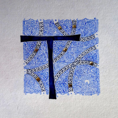
The showers were more numerous than expected this weekend so I had time to finish my initial T.
Tag: gold leaf
Last commission before Xmas
If you want me to draw an initial or to write a text for this Xmas, it’s too late. I just finished the last commission & will not be able to do anything else before Xmas (you can still buy some of my older works 😉 ).
Here are some pics of the different steps of the work.
The instructions were a blue R and something about the sea. I looked at some old medieval maps and let my nib ramble on the paper.
gilding & painting of the letter.
filigrees
Back to paperwork for an initial with filigrees. This is only a detail first because it isn’t finished yet and second because I don’t want to spoil the surprise for the person who will receive it.
blue vine
Valentine’s day
Initial D
I’ve just finished a new initial with filigrees. Nothing special to say about it, it’s the kind of thing I do whithout even thinking about it now.
Initial
While waiting for inspiration for more ambitious works, I continue with filigrees. This time it is a V and in blue shades to change a bit from the usual B&W.
Walnut stained vine
No time nor inspiration these times to create any calligraphic work but nevertheless itching to use my nibs and a rest of walnut stain at the bottom of a glass…
Flowers
Being inspired by the filigree pattern used in my latest initial, I decided to reuse it to create a small illumination, this time with ferro-gallic ink and wallnut stain to remain close to the shade of the kraft paper.
Initial C
A recent happy occasion “forced” me to take my nib and to make one of those filigree initials I like so much.
It’s to celebrate the birth of a little girl and after rejecting the pink, I eventually chose the white.
Here is a picture of a part of the initial where one can see the shiny texture of the letter (which I love !).


